AUDAX
2024
Neo Design System
The Neo Design System is the base design system for audax's white label banking products.
When I joined SC nexus (now audax) in early 2022, it was in the midst of a spin-off from SC Ventures. As the lead designer responsible for maintaining Neo, I was in charge of rebranding it to fit audax's brand and beyond that, maturing the design system to improve communication with developers and improve its usability for designers.
The following is a series of my contributions to the design system.
Design system
Documentation
Collaboration
Execution
Rebranding the design system
As part of the spin-off process, there was a need to rebrand our design system to move away from Standard Chartered's styling to fit audax's new brand style guide. Besides replacing the font style and colour palette, I also created a new set of icons and animations.
Drag the slider to see the before and after.
Setting up for responsive design
The problem
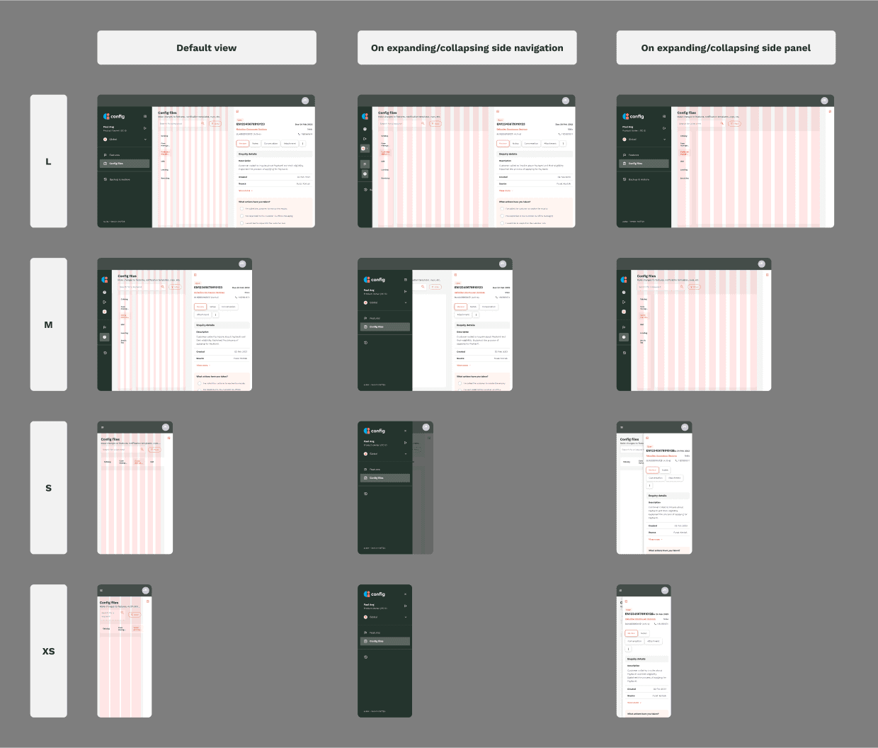
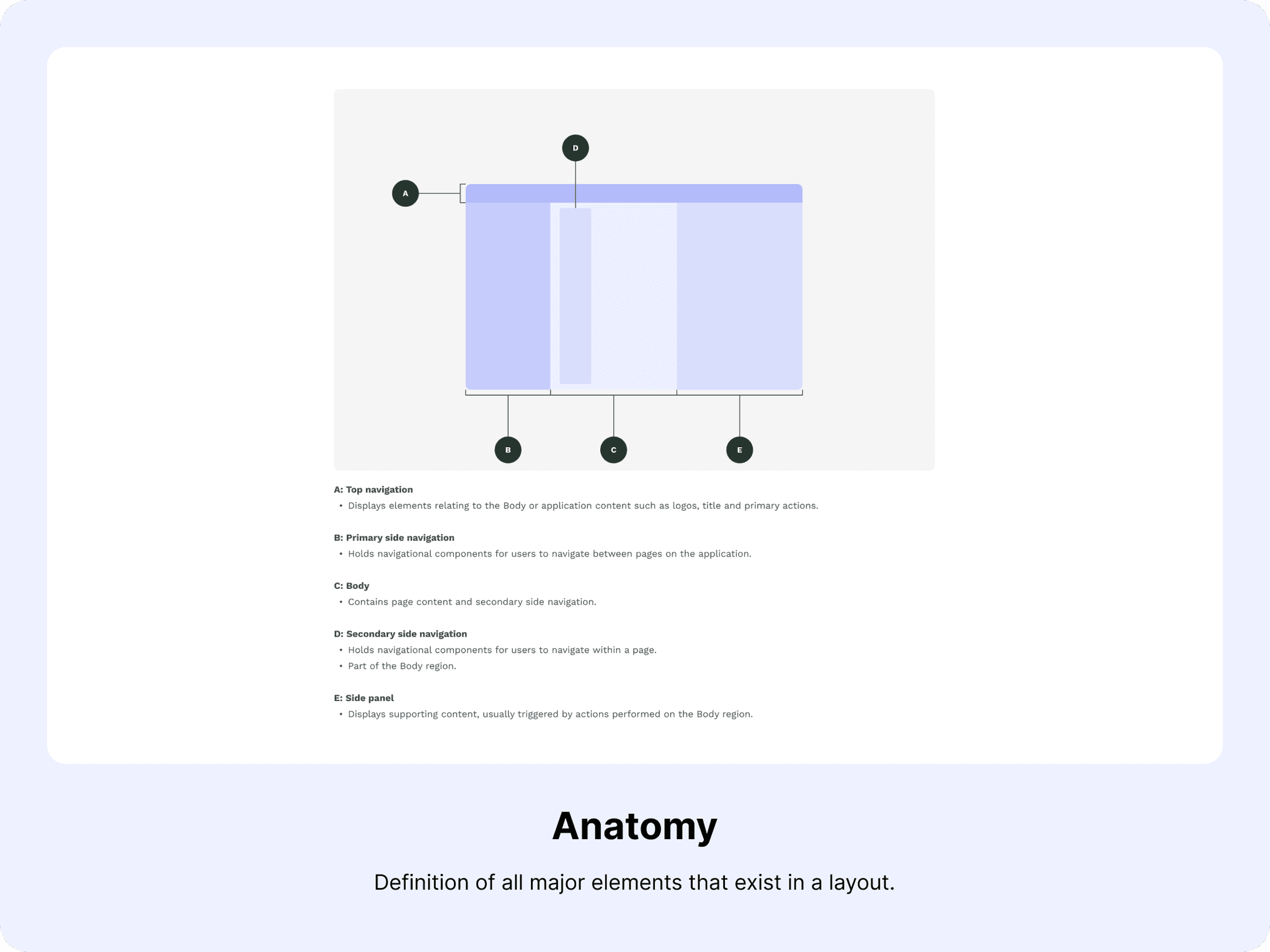
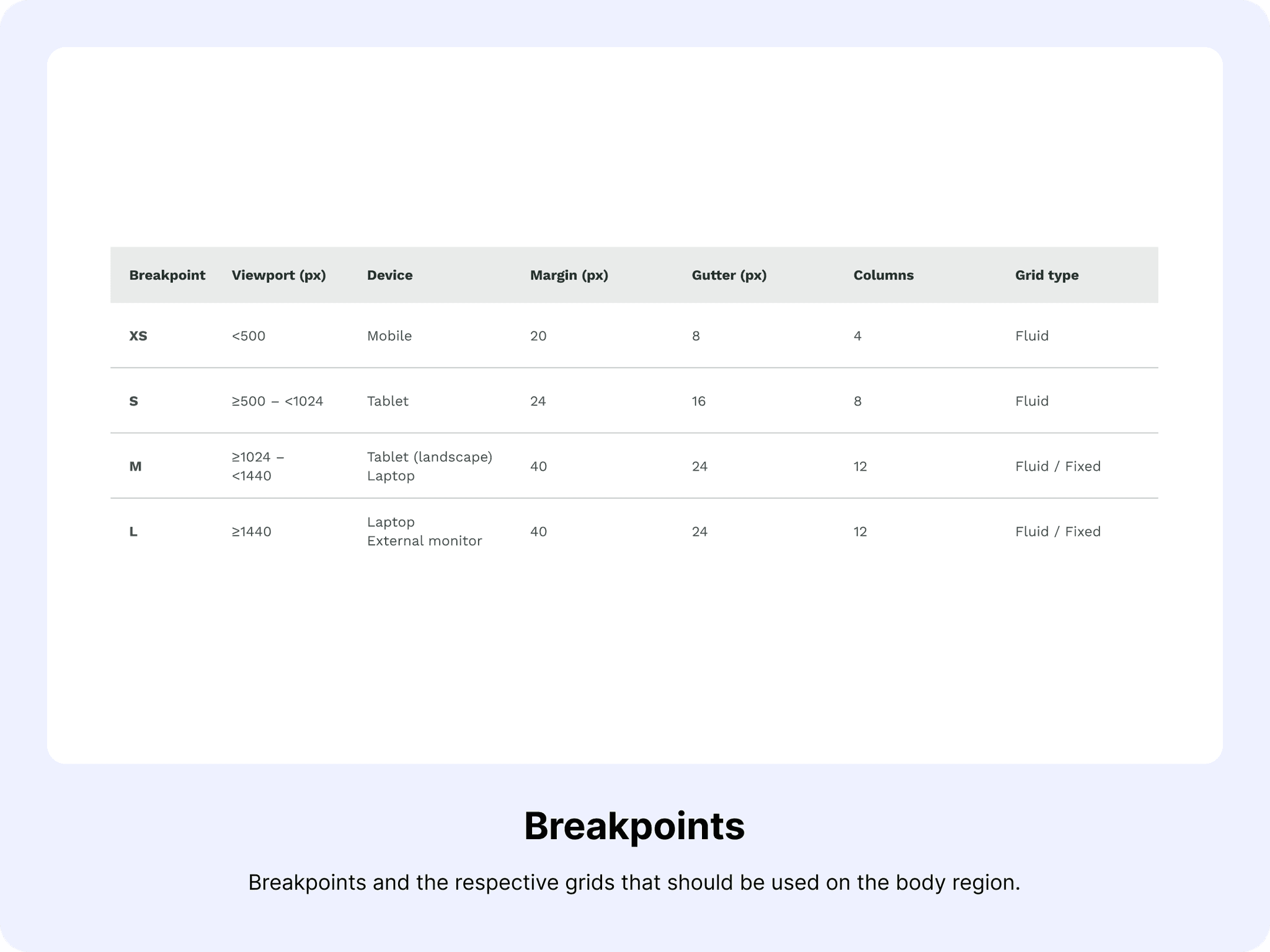
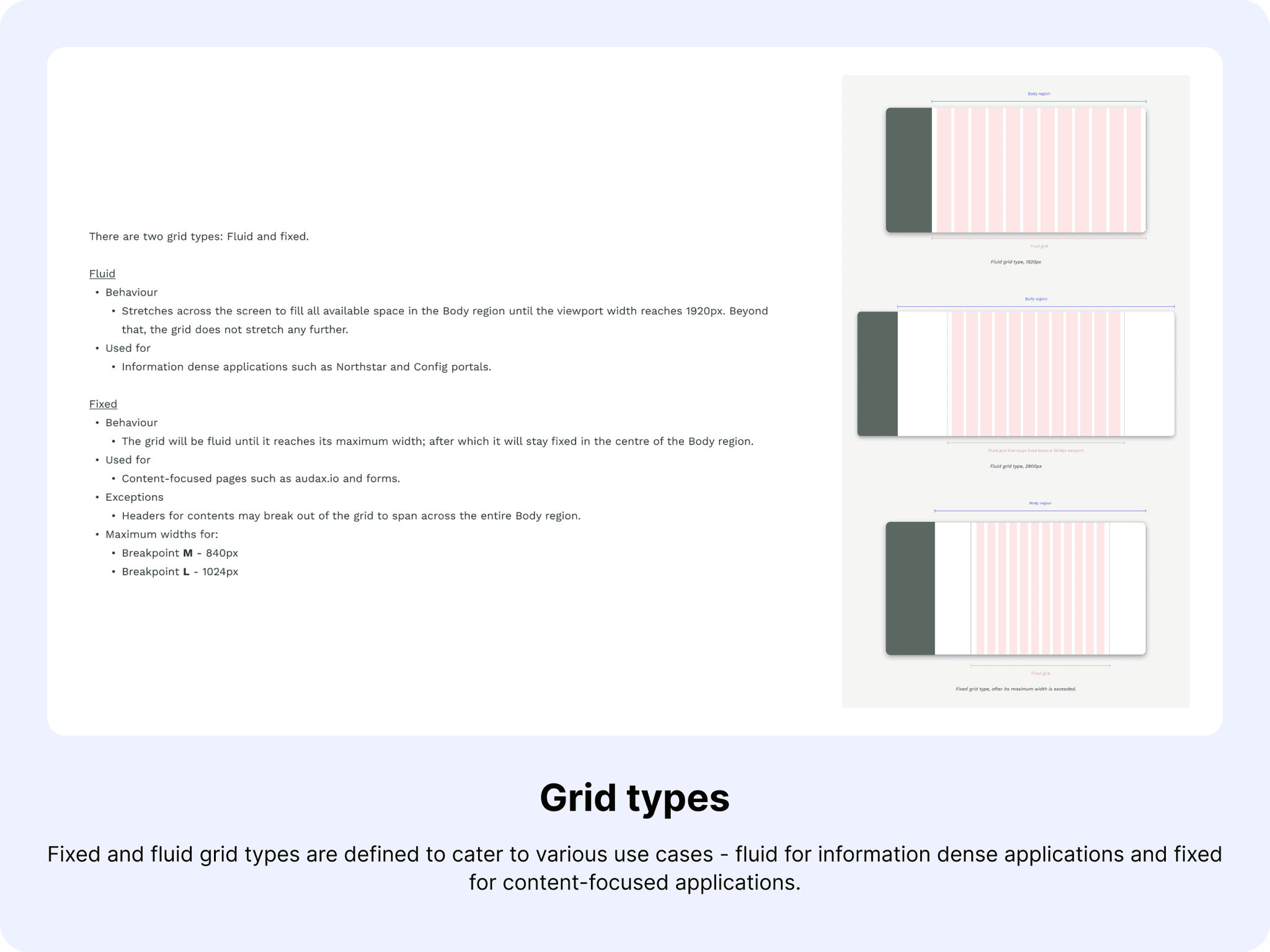
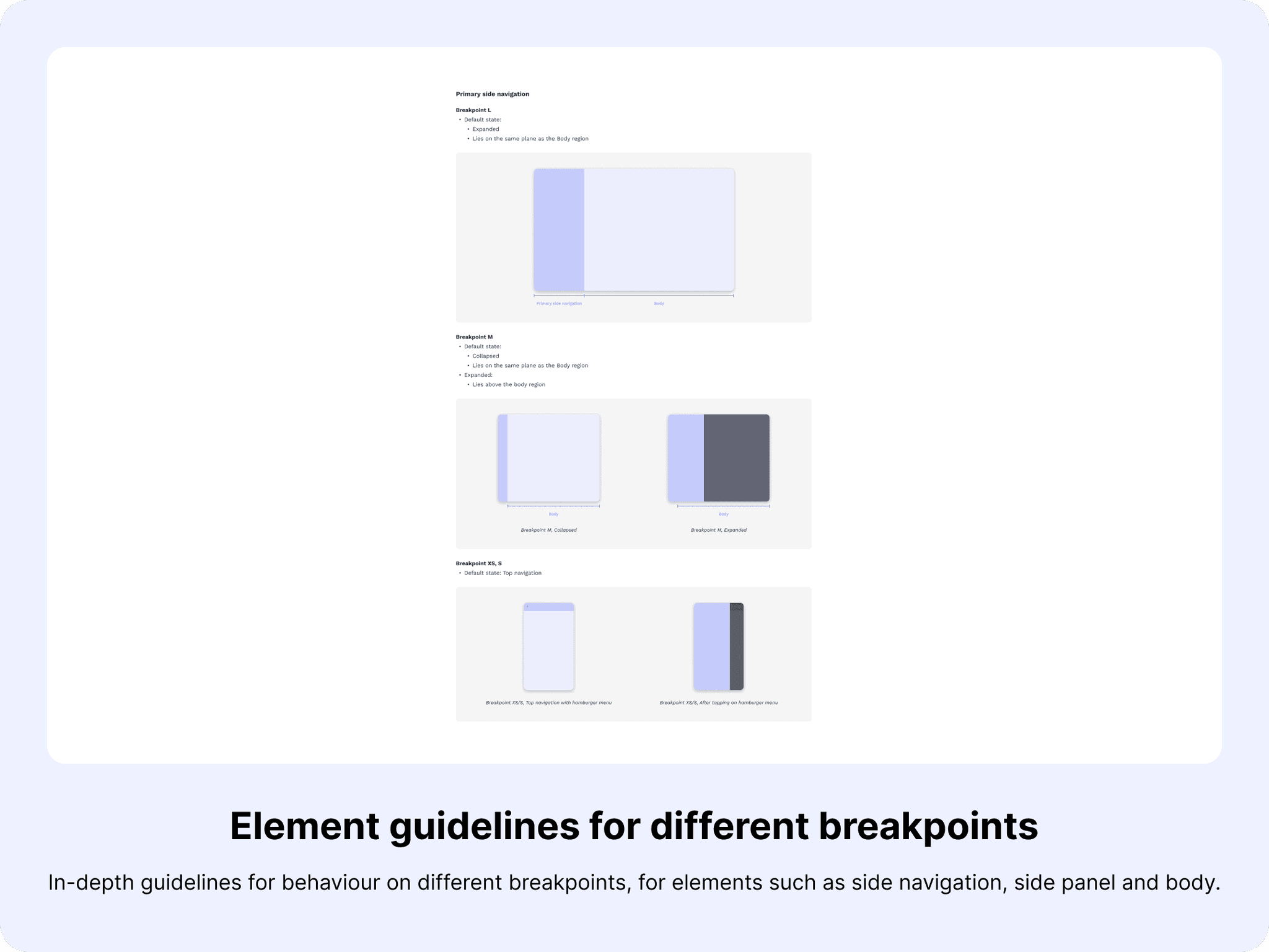
The design system did not initially have well-documented guidelines for responsiveness as we were designing for mobile/desktop-only applications. However, as we expanded our offerings to include web-based applications that can be used on various device sizes, there was a need to clearly document a robust responsive layout grid system to communicate with both designers and developers on how to position content.
The process
To ensure that I followed best practices, I referred to several established design systems such as Ant, Material, Atlassian and Spectrum. Through these references I got a sense of what needs to be defined, and also some guidelines to default to - breakpoints, grids and layouts for example. To ensure that these guidelines are truly suitable for our use case though, I tested them out using our own components.
This exercise not only allowed me to ensure that the guidelines made design sense, but it also helped the developers to visualise them during the reviews.
The result
After a few rounds of review with fellow designers and developers, this is what was covered in the final guidelines.
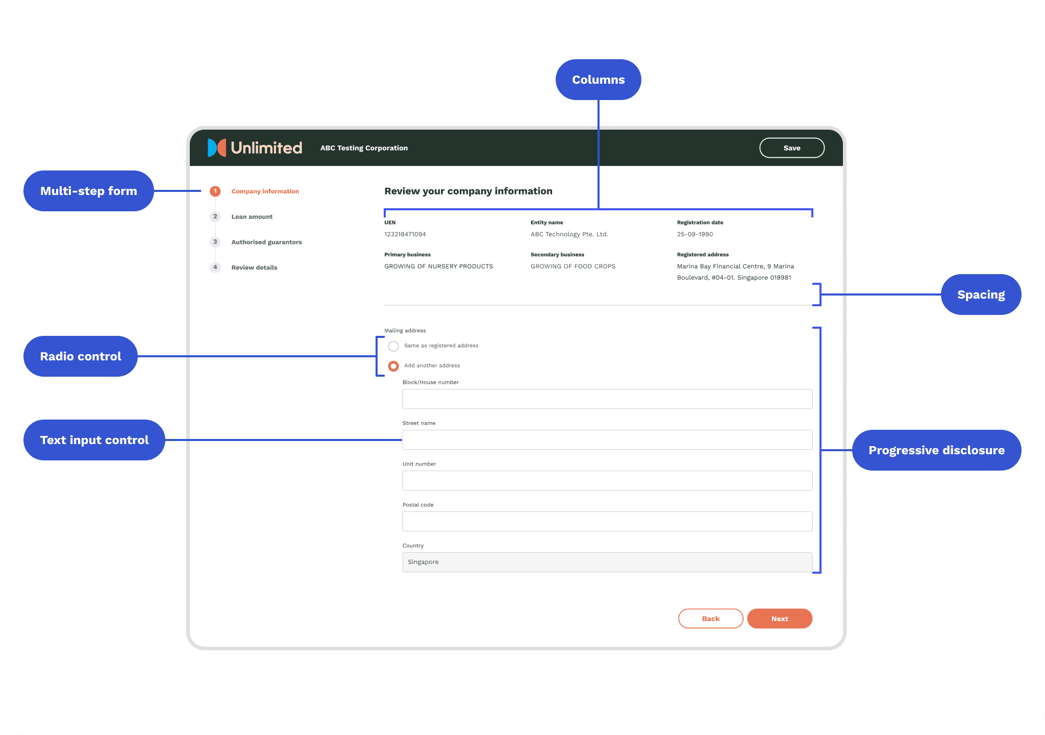
Supporting server-driven form rendition
The problem
Due to the lack of documentation and missing component states, developers often have to improvise and guess component behaviours which can lead to inconsistency across web, iOS and Android teams. This issue became even more pressing as audax moved to server-driven UI for form rendering as it was difficult to configure how components should be rendered without clear guidelines on their behaviour.
The process
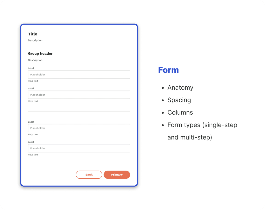
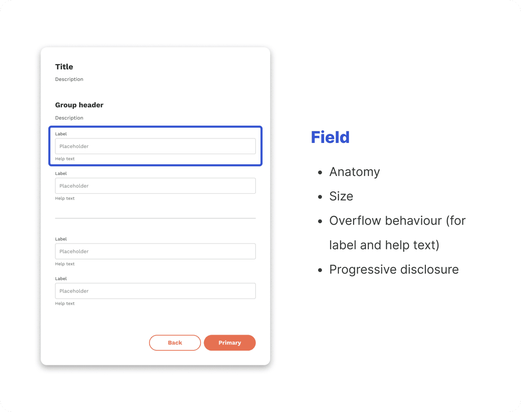
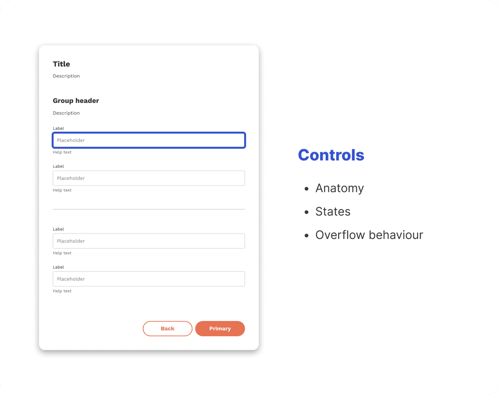
For server-driven form rendition in particular, I once again referred to design systems such as Carbon and Goldman Sachs which have extensive documentation on form elements. Although deceptively straightforward at first, I soon discovered that just documenting the behaviour of form fields wouldn't suffice. To ensure that I covered all grounds, I structured the guidelines in 3 levels of granularity - form, fields and controls.
The result
Form components have now been configured by the web development team based on this set of guidelines for server-driven form rendition, which has been adopted by our web-based business banking origination product. This will allow product owners and clients to make changes to the form with minimal design and development effort as forms will automatically render based on the configurations.
