AUDAX
2013
Cash loan
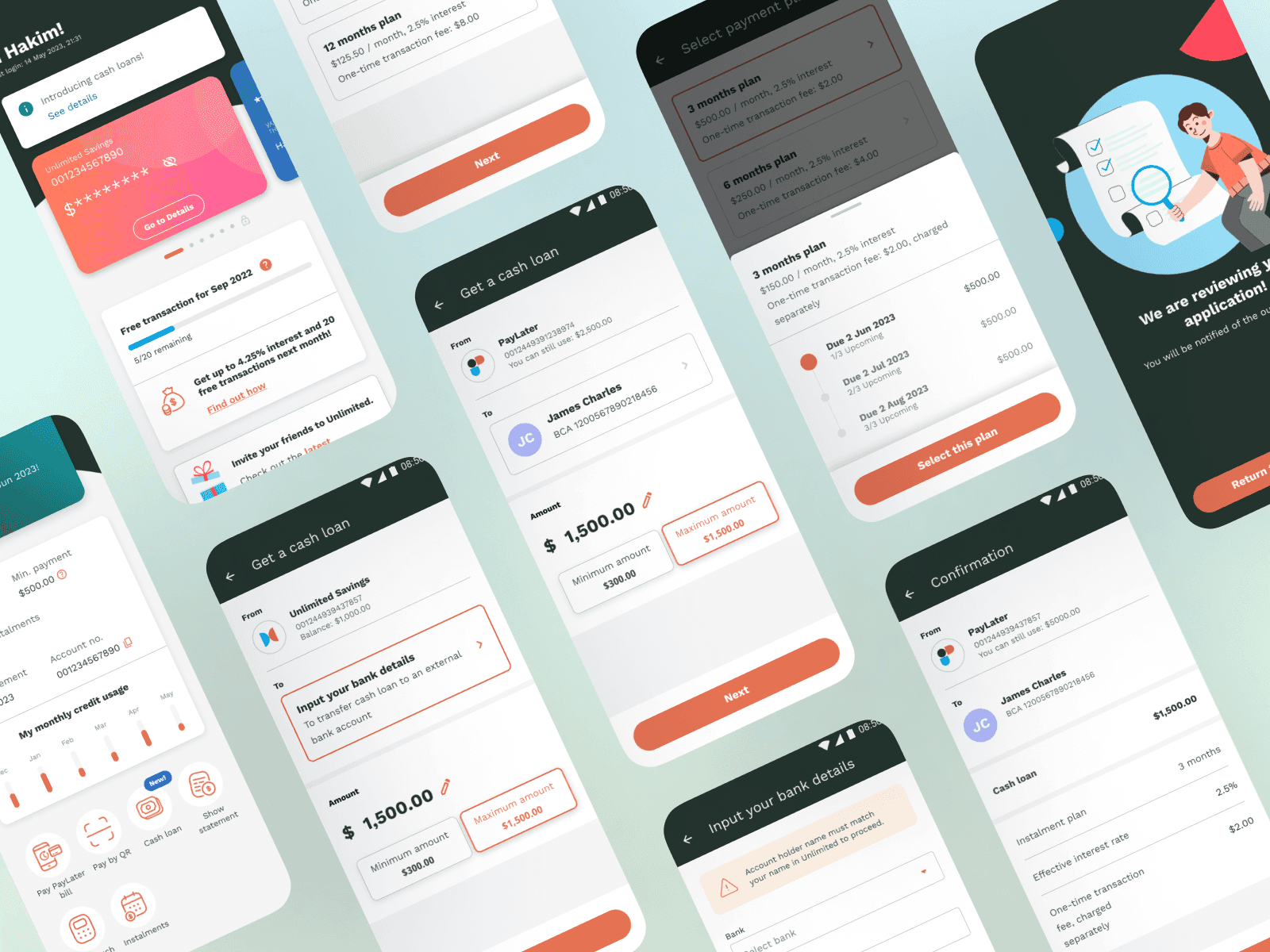
Unlimited is audax’s white-label banking application that offers Buy Now Pay Later (BNPL) services. The addition of cash loans seeks to expand the range of loans users can use BNPL for besides QR payments and retail purchases. Cash loans will allow users to take out loans that will be disbursed to their savings account once approved.
UI/UX
Usability testing
Prototyping
User flows
Define
Requirements & constraints
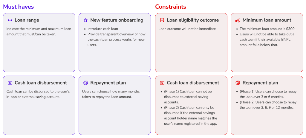
Due to strict regulations and backend decision processes, working on a banking application often involves many constraints. Before beginning any design work, it is important to understand what we are working with to limit redundant design effort.
During this initial phase, I collaborated closely with the product owner and design manager to establish the constraints and must-haves required for this flow.
Guidelines
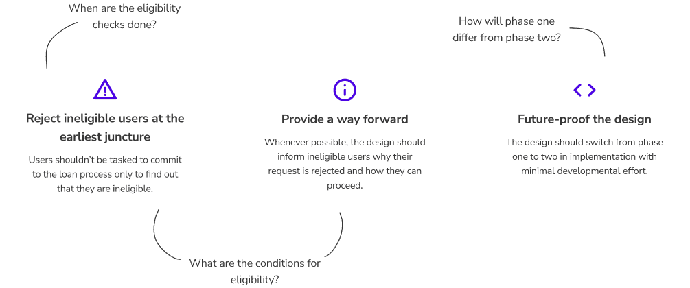
I defined some guidelines to ensure that user experience remains a top priority regardless of the constraints faced and to plan what needs to be done during the development phase of the design process. These guidelines also helped me identify crucial details that needed clarification during discussions with other stakeholders.
Develop
User flow
Based on the flow initially outlined by the product owner, I proposed a new flow that informs the user of their eligibility and maximum loan amount right at the start, removing any redundant effort required from the user to re-adjust their initial requested amount.
Due to evolving backend constraints, however, the user flow went through another four iterations. Ultimately, through constant communication and collaboration, all stakeholders were able to arrive at a flow that removes extra effort from the users while also being technically feasible.
Usability testing
I conducted two usability tests using Maze. The first round was conducted internally, recruiting colleagues from audax to identify glaring user flow issues and test the usability of certain features.
Based on the findings, we reiterated the design to prepare for the second round of testing.
Loan amount input
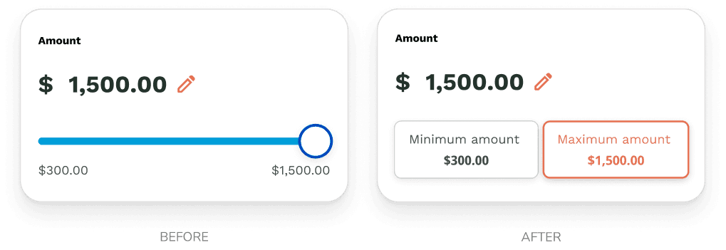
Using a slider to convey the loan range only frustrated users who tried using it as an input control, as it was difficult to slide to exact amounts. Since this issue will only become more pronounced in countries with larger currency denominations, I removed the slider and replaced it with buttons to select the minimum or maximum loan amount quickly. Specific amounts can be keyed in manually, which was the method most users preferred.
Cross selling
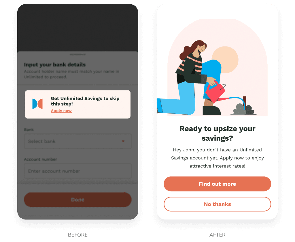
Since users without the app’s saving product have to go through an extra step of inputting their external account details, we wanted to take the opportunity to cross-sell the product to such users. Test users were hesitant to tap on the card to apply for the savings product mid-journey as they were worried about losing their application progress. In the iteration, I opted for a full-screen overlay at the end of the journey instead to increase the rate of click-throughs.
The second round of usability testing recruited end users from Indonesia, where our white-label app is based. The iterated design proved to be effective, as issues identified in the first test did not recur. This allowed us to identify issues unique to our end users.
Screen title
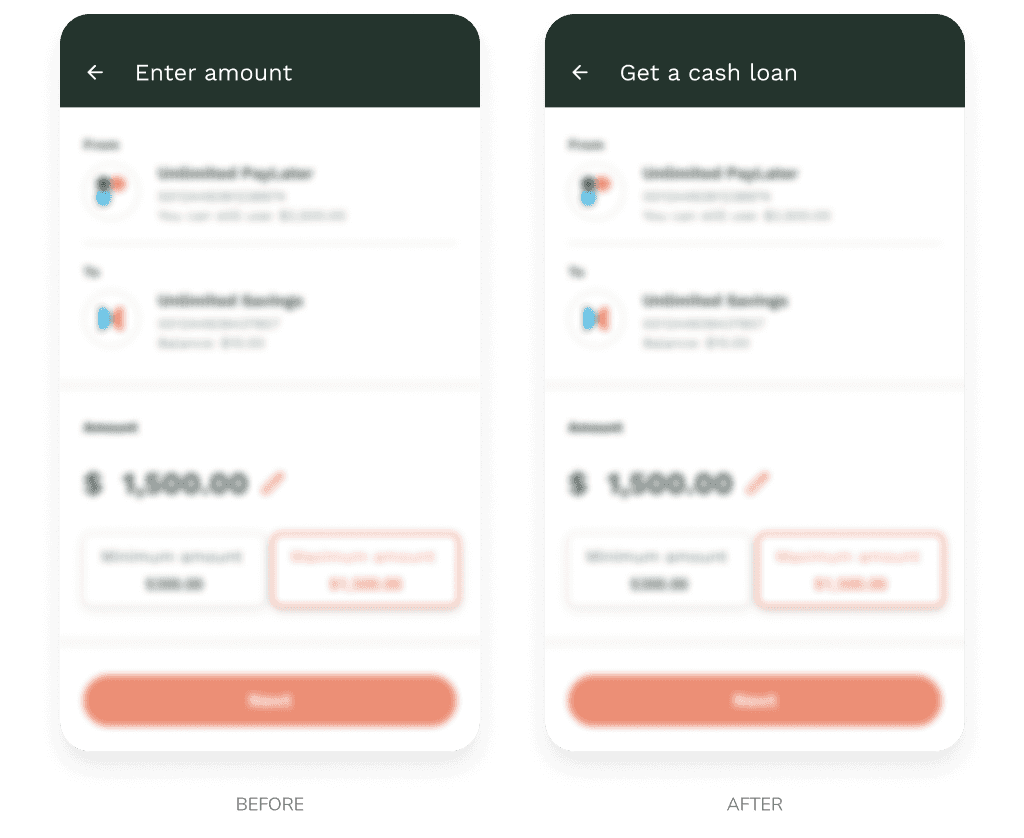
The test revealed that the vague screen title was disorientating for users familiar with the rest of the app, as the screen content was very similar to other features such as fund transfer and bill payment. To address this, the revised screen title explicitly states, ‘Get a cash loan’ to reassure users that they are in the correct flow.
